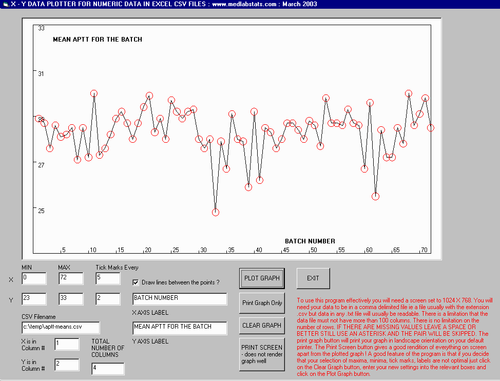
To use this program effectively you will need a screen set to 1024 X 768. You will need your data to be in a comma delimited file ie a file usually with the extension .csv but data in any .txt file will usually be readable. There is a limitation that the data file must not have more than 100 columns. There is no limitation on the number of rows. IF THERE ARE MISSING VALUES LEAVE A SPACE OR BETTER STILL USE AN ASTERISK AND THE PAIR WILL BE SKIPPED. The print graph button will print your graph in landscape orientation on your default printer. The Print Screen button gives a good rendition of everything on screen apart from the plotted graph ! A good feature of the program is that if you decide that your selection of maxima, minima, tick marks, labels are not optimal just click on the Clear Graph button, enter your new settings into the relevant boxes and click on the Plot Graph button.
Comma delimited data looks like this in Notepad or similar text editor such as TextPad :
1, 56, 01/02/2003, placebo
2, 112, 01/02/2003, test
3, 115, 02/02/2003, test
4, 62, 02/02/2003, placebo
5, 71, 03/02/2003, placebo
The image below gives you an idea of the depth of design.
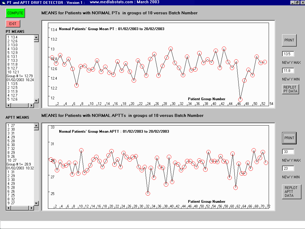
Example of the use of this program in a customer's program that monitors the moving averages of prothrombin times and APTT's measured in individuals who have normal values for this test. As the reagents deteriorate with time results can drift before conventional QC samples reveal the trend. This is the Coagulation Lab's approximation to the Haematology Lab's Bull's Mean technique for detecting drift in haematology analysers. :