|
STATISTICS FOR ABSTRACTS |
|
|
STATISTICS FOR ABSTRACTS |
Perhaps many of us have been guilty of carrying out a study, tabulating the data and then handing them over to a statistician in the hope that he or she will be able to detect the message in the data. What this situation reveals is that we, the investigators, failed to write down before we started the hypothesis(es) that we wished to test. In fact what we are probably hoping is that the statistician will find some 'statistically significant' features in our data set around which we will write a hypothesis. A sort of reverse engineering. Actually I would regard this as being an overly harsh account of what actually happens. From my experience most people who come to me for statistical advice have in fact had very good reasons for designing the experiment / project the way they have. They are the experts in their field and often what they have done is respond to their professional sixth sense and gone and done the instinctively necessary investigations. Their usual mistake has been to omit to measure a particular parameter which would have given a great deal more statistical power to their study. So their statistical report, which is good, often lacks that all important finishing touch which would make the report both excellent and thoroughly convincining. So with those thoughts in mind I would urge you to write down some hypothesis(es) now relating to the work you are planning to present, before launching into your statistical analysis.
THE HYPOTHESIS
A hypothesis is best kept simple eg.- changing 'x' will improve 'y'. Anything more complicated will make it difficult to present in a 10 minute paper or describe on a poster that most viewers will look at for less than 5 minutes.
Avoid drawing up Hypotheses that contain conditional clauses eg. - changing 'x' in patients without significant symptoms of 'y' will show an improvement in 'z'. It is better to split the hypotheses : First we will prove that our patients had little or no evidence of symptoms 'y'. Then we will prove that in these same patients changing 'x' actually improved 'z'.
SOME EXAMPLES
Statisticians prefer to write papers and articles in the language of algebra. Most of do not think in algebraic terms - so if I continue to use algebraic language in this article many readers will read no further. Instead I will give the examples fictitious titles - and equally fictitious data - that should sound a bit more inviting to the reader.
|
|
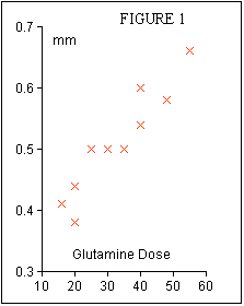
This title immediately reflects a simple hypothesis - if we give more glutamine in the TPN mix then villous atrophy is reduced. The fictional experiment simply involved giving ten rats 3 days of glutamine free TPN - so that gut atrophy would become established - and then putting glutamine supplements into their TPN mix and measuring intestinal villous height after a further 3 days.
The glutamine supplements were calculated as mg/kg body weight/day and the villous heights were measured in mms. The results were as shown in Table 1.
| Glutamine | Height | Glutamine | Height |
| 16 | 0.41 | 35 | 0.50 |
| 20 | 0.38 | 40 | 0.54 |
| 20 | 0.44 | 40 | 0.60 |
| 25 | 0.50 | 48 | 0.58 |
| 30 | 0.50 | 55 | 0.66 |
To reveal whether or not glutamine supplements have affected villous height it is appropriate to draw a graph as shown in Figure 1. The rule that must be observed in plotting such a graph is that the parameter which we have manipulated must be put on the 'x' axis and the parameter we have measured must be put on the 'y' axis. Then we can calculate the equation to the line of best fit through the points and the correlation coefficent which gives a measure of the goodness of fit. The safest way to calculate these is to use a statistical calculator or a 'tool' in a computer spreadsheet program such as Excel or Cricket Graph. However, if you do not have access to these then it is not too difficult to do it with a simple calculator taking care to record the results on a piece of paper as you go :
Now work out three intermediate results :
Now the Slope of the Line of best fit is easily calculated by dividing A by B = 0.00634.
The Intercept of the line on the Height, (y), axis is easily calculated :
The Correlation Coefficient is also easy to calculate. First multiply B by C and take the square root of the answer before dividing it into A.
We can now express the results of our experiment in an equation :
So from this experiment we can describe the outcome as follows : There was a progressive improvement in villous height with glutamine supplementation of the TPN mixture such that over the range of supplements given, 16 - 55 mg/kg/day, there was a statistically significant increase in villous height of 0.25 mm.
Now that statement can only be made because of our knowledge of the equation to the line of best fit. One of the most common ommissions in abstracts is not to make use of this equation which is odd because so much effort goes into calculating it! The majority focus on the correlation coefficient alone in which case all they can say is that there was a statistically significant effect observed. The equation to the line gives you the functional relationship between the supplement and the villous height. It enables you to describe the 'dose response' of your experiment in very practical terms : over the range of supplements given, 16 - 55 mg/kg/day, there was a statistically significant increase in villous height of 0.25 mm. How did I derive this 0.25 mm, well I substituted 16 mg/kg/day into the equation and calculated the corresponding villous height, 0.40 mm. Then I substituted 55 mg/kg/day into the equation and calculated that villous height, 0.65 mm. The difference between these is 0.25 mm which I now claim to have occurred as a consequence of supplementing with glutamine.
I have described the response as having been statistically significant without giving any justification. My justification lies in an assessment of the value of the correlation coefficient of 0.942. Suffice it to say that statisticians have drawn up tables in which the statistical significance of any value of correlation coefficient derived from any number of data pairs have been drawn up. It it difficult to describe succintly how to look up these tables but the secret is to take 2 away from the number of data pairs in your experiment, run your finger down the left hand column until you reach that number, in our case 8, and then move your finger across until you reach a number in the column marked '0.05'. If your correlation coefficient is greater than this number then relax - your correlation coefficient is significant at the p =< 0.05 level. A very truncated table for assessing your correlation coefficient is shown in Table 2.
Now let us move on to another type of paper :
|
|
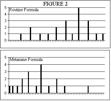
In this study two groups of patients were investigated. The first group of twenty one patients had their liver function assessed in terms of their GGT levels after five days of TPN with their routine TPN mix. The second group of twenty one patients received the new amino acid solution Metamine and their GGT levels were measured after five days. The results were as shown in Table 3 and as Histograms in Figure 2.
The histograms show that the data in the two groups are not normally distributed ie they do not have the characteristic bell shape of the Normal Distribution Curve. This immediately alerts us to beware of using means, standard deviations etc. because these statistical tools all assume that the data that you are providing for analysis are 'normally distributed'. Instead we should use non-parametric measures. The non- parametric measure of central tendency is the median. Because we have an odd number of data points in each data set it easy to locate the median value. It is the data point that is the eleventh from the top or bottom of the data sorted in increasing order. In the Routine Formula data the median is unequivocal - it is 500. But in the Metamine data the eleventh data point is alongside two other points of the same value ie 240. This means that our median is between 240 and 250; in fact it is 2/3rds of an interval up above 240. This is 246.6 but because we have only measured GGT values to the nearest 10 the best relevant estimate of the median of these data is the rounded up value of 250. You can calculate confidence limits to the median; this is akin to calculating the Standard Error of the Mean but as you will see the limits are assymetric because of the assymetry of the data distributions. The formula you have to use returns the position numbers of the lower and upper limits in your list of sorted data.
| Routine Formula TPN | |||||
|---|---|---|---|---|---|
| 160 | 240 | 240 | 300 | 350 | 400 |
| 400 | 460 | 460 | 460 | 500 | 540 |
| 540 | 540 | 540 | 540 | 600 | 600 |
| 600 | 650 | 700 | |||
| Metamine Formula TPN | |||||
| 80 | 100 | 130 | 160 | 160 | 200 |
| 200 | 200 | 240 | 240 | 240 | 270 |
| 300 | 300 | 300 | 300 | 350 | 400 |
| 400 | 450 | 600 | |||
The procedures are as follows:
So for our data sets the findings are shown in Table 4.
| Lower Confidence limit | Median | Upper Confidence Limit | 95% Tolerances | |
| Routine Formula | ||||
| Metamine Formula |
Clearly the difference of 250 between the medians at a worst case is more tahn 2.5 times the size of the largest tolerance, -100. So the Metamine formula appears to be a lot less hepato irritant than the Routine formula. If we were using parametric statistics we would use a 'Studet's t Test' to assess the difference between the two means and on getting a 't' value in the vicinity of 2.5 we would conclude that the Metamine had a very significant beneficial effect. The non-parametric equivalent of the Student's t Test is the Mann-Whitney Test. This involves pooling the two data sets and organising them into a single table sorted in increasing order taking care to tag each item as to which data set it was originally drawn from - the Metamine set or the Routine set in our case. Our pooled data set is shown in Table 5 with the Routine data set items tagged with the letter 'r' and the Metamine data set items tagged with the letter 'm'
| 080m | 100m | 130m | 160m | 160m | 160r | 200m | |
| Item # | 1 | 2 | 3 | 4 | 5 | 6 | 7 |
| Ranking | 1 | 2 | 3 | 5 | 5 | 5 | 8 |
| 200m | 200m | 240m | 240m | 240m | 240r | 240r | |
| Item # | 8 | 9 | 10 | 11 | 12 | 13 | 14 |
| Ranking | 8 | 8 | 12 | 12 | 12 | 12 | 12 |
| 270m | 300m | 300m | 300m | 300m | 300r | 350m | |
| Item # | 15 | 16 | 17 | 18 | 19 | 20 | 21 |
| Ranking | 15 | 18 | 18 | 18 | 18 | 18 | 21.5 |
| 350r | 400m | 400m | 400r | 400r | 450m | 460r | |
| Item # | 22 | 23 | 24 | 25 | 26 | 27 | 28 |
| Ranking | 21.5 | 24.5 | 24.5 | 24.5 | 24.5 | 27 | 29 |
| 460r | 460r | 500r | 540r | 540r | 540r | 540r | |
| Item # | 29 | 30 | 31 | 32 | 33 | 34 | 35 |
| Ranking | 29 | 29 | 31 | 34 | 34 | 34 | 34 |
| 540r | 600m | 600r | 600r | 600r | 650r | 700r | |
| Item # | 36 | 37 | 38 | 39 | 40 | 41 | 42 |
| Ranking | 34 | 38.5 | 38.5 | 38.5 | 38.5 | 41 | 42 |
The next step is to add up the position numbers of all the Routine data set items :
5 + 12 + 12 + 18 + 21.5 + 24.5 + 24.5 + 29 + 29 + 29 + 31 + 34 + 34 + 34 + 34 + 34 + 38.5 + 38.5 + 38.5 + 41 + 42 = 604
Do the same for the Metamine data set :
1 + 2 + 3 + 5 + 5 + 8 + 8 + 8 + 12 + 12 + 12 + 15 + 18 + 18 + 18 + 18 + 21.5 + 24.5 + 24.5 + 27 + 38.5 = 299
Note that because there are several sets of ties, the rankings are not identical to the Item number (#). Wherever there are ties you must add the all the respective Item Numbers involved together, divide by the number of items involved in that tie and then that value equals the ranking of each of the items in that tied group.
For example there are five items tied at a GGT value of 240; the sum of their item numbers is 10 + 11 + 12 + 13 + 14 = 60, which divided by 5 equals 12. Hence these 5 items all have the same ranking of 12.
Now if we had a situation where the data from each set was randomly intermingled with each other then when we would expect the sums of the rankings from each data set to be the same. In this example we have a total of 42 items, the sums of the rankings of all of them equals 903 and hence we would expect the sums of the rankings from the Routine Formula to equal the sums of the rankings of the Metamine Formula which in turn would equal 903/2 = 451.5
Our sums of the rankings are quite different from that. How do we assess the statistical significance of that difference? Well we do a Standard Normal Deviate style test for which we need a difference and a standard deviation. We have a difference - the difference between 451.5 and by convention the lower observed sum of rankings ie. the Metamine Formula data set with a rank sum of 299. That difference is 152.5. Statistians have determined that a standard deviation for this sum of ranks procedure can be calculated as follows :
So in our case this we are after the square root of 21 X 21 X 43 / 12 which is the square root of 1580.3 = 39.8
A Standard Normal Deviate, usually represented by a capital Z, is now easily calculated as the difference divided by the SD; in our case
The attractive feature of Z is that provided we have more than 10 data items each group then the interpretation criterion is the same ie. a Z value that is equal to or greater than 1.96 is statistically significant at the p < 0.05 level.
So in this example we can see that the sums of the rankings are both significantly different from the theoretical mean of the pooled data, and per se are significantly different from each other.
So in our abstract and presentation we can claim with considerable confidence that the Metamine Formula TPN was associated with a very significant amelioration in the LFT's as monitored by the serum GGT activities.
One final point; this discussion of the Wilcoxon Mann-Whitney Test has been illustrated with equal numbers of items in both treatment groups. Please contact the author if you want to apply the test to two groups of unequal size; there is a minor and easy modification step in the calculation of the theoretical rank sums.
The third type of paper I would like to consider is one in which when you plot the data there is clearly a profile to the results but it is non-linear. The question then is what tool should you use to assess the significance of this data profile. The title of the hypothetical paper is
|
|
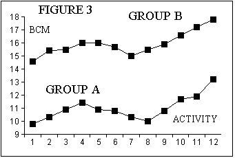
In this study the activity levels of two groups were assessed, activity level 1 was assigned to individuals took no additional exercise through to activity level 12 which signified that those individuals were involved in a routine of daily body building exercise. Grades between 1 and 12 were levels of progressively increasing exercise. Table 6 shows the data for Group A, who were the immunosuppressed individuals, and Group B who were the normal individuals ie controls. When these data sets are plotted out then you can see in Figure 3 that progressive levels exercise were associated with increasing Body Cell Mass, (BCM), up to about Exercise Level 4, then tended to decline as the exercise level was increased to about Level 8, and thereafter BCM progressively increased again. So the graph immediately suggests that the responses to exercise in the two groups had very similar profiles and that the only real difference was that the immunosuppressed individuals, Group A, had lower BCMs and could only approach normal values if they embarked upon a conscious programme of body building exercise at Level 12.
| Exercise Level | Group A Patients, BCM, kg/m | Group B Normals, BCM, kg/m | Difference between Rankings | Differences Squared |
| 1 | 9.8 (1) | 14.6 (1) | 0 | 0 |
| 2 | 10.3 (3.5) | 15.4 (3) | 0.5 | 0.25 |
| 3 | 10.9 (7.5) | 15.5 (4.5) | 3 | 9 |
| 4 | 11.4 (9) | 16 (8.5) | 0.5 | 0.25 |
| 5 | 10.9 (7.5) | 16 (8.5) | -1 | 1 |
| 6 | 10.8 (5.5) | 15.7 (6) | -0.5 | 0.25 |
| 7 | 10.3 (3.5) | 15 (2) | 1.5 | 2.25 |
| 8 | 10 (2) | 15.5 (4.5) | -2.5 | 6.25 |
| 9 | 10.8 (5.5) | 15.9 (7) | -1.5 | 2.25 |
| 10 | 11.7 (10) | 16.6 (10) | 0 | 0 |
| 11 | 11.9 (11) | 17.2 (11) | 0 | 0 |
| 12 | 13.2 (12) | 17.8 (12) | 0 | 0 |
Plotting the two data sets, Group A versus Group B, would give you a fairly good straight line but you could not perform a linear regression analysis and calculate a correlation coefficient on this and expect a statistician to agree with your approach. For a start the data in each set are not random samples etc. etc. So what you need to do is perform a non-parametric correlation analysis called the Spearman Rank Order Correlation Analysis. Notice that there is a number in brackets alongside each data item in the Table 6. This is the ranking of that data item relative to the other data items in that column.
Working these rankings out is the hardest part of this test. You must rank each item without moving out of its row. So first of all write down the numbers 1 to 12 on a piece of paper. Then find the smallest value in the column and write (1) next to it, cross off 1 on your piece of paper, and then go hunting for the next highest value in the column, write (2) next to it and cross off 2 on your piece of paper, and so on ... Without that piece of paper with 1 to 12 written on it, you can easily get mixed up with your sorting ! Notice that in this data set there are tied values and we used the rule of applying the mean of the tied rankings to the members of the ties just as for the Wicoxon Mann-Whitney Test.
The next column in Table 6 shows the differences between the rankings of the items in Group A and Group B, and the final column is the square of these differences.
The last step is to solve a simple equation :
The significance of this Correlation can be assessed using the abbreviated Table 7 below
| Number of Observations | p=0.05 Significance Level | Number of Observations | p=0.05 Significance Level |
So we can see from this table that our Spearman Rank Order Correlation Coefficient of 0.925 is highly significant and we can justifiably claim in our paper and abstract that the exercise response of individuals in the two groups are almost identical, at the p<0.05 level of significance, and that they are separated by an almost constant difference of about 5 kg/m at every level of exercise.
So in conclusion the messages are to define your hypothsis(es) clearly and then select the appropriate parametric or non-parametric statistics tool to corroborate your conclusions.
Bibliography :
Nonparametric Statistics for the Behavioural Sciences, S. Siegel and N. John Castellan, McGraw-Hill Book Co., 2nd Edition, 1988, ISBN 0-07-057357-3
Statistical Methods, G. W. Snedecor and W. G. Cochran, Iowa State University Press, 7th Edition, 1980, ISBN 8138-1560-6
An Introduction to Medical Statistics, M. Bland, Oxford University Press, 1987, ISBN 0-19-261502-5